Dr. Martens
Brand Application Study
Approach:
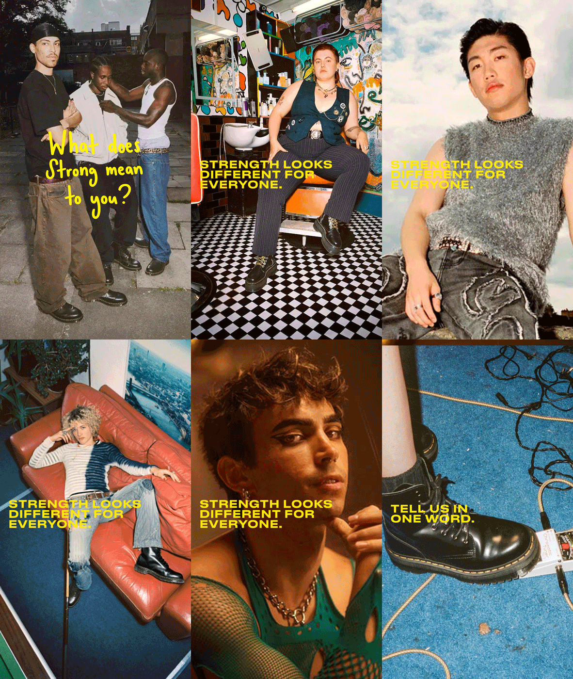
Rather than creating a new campaign, I chose to extend Made Strong, adapting an existing global campaign into a series of social-first assets.
I analysed the campaign across different touchpoints to identify the visual principles that remained consistent throughout. Instead of replicating individual layouts, I focused on understanding the system behind the campaign—its typography, spacing, hierarchy, composition and the relationship between photography and copy. To remain as faithful as possible to the existing visual identity, I used Druk Text Wide, as it closely reflects the typography used throughout the original campaign.
Using those observations, I recreated the campaign's spacing system as a reusable template and designed three social assets that extend the campaign while adapting naturally to Instagram.
Visual Principles
Bold, all-caps typography in the brand's signature yellow
Consistent spacing and text positioning
Photography-led, editorial layouts
Minimal copy with a clear visual hierarchy
A balanced use of portrait and product imagery
Why this campaign?
I intentionally selected a campaign with a minimal visual toolkit—primarily photography and typography. Working within these constraints allowed me to focus on understanding an existing visual system and applying it consistently across new touchpoints.
Copy used throughout this exercise was created with AI solely to simulate a creative brief. The visual concept, layout system and campaign adaptation are my own.


Thank you for taking the time to look through this Brand Application Study.
I hope it gives you a glimpse into how I approach brand systems, visual consistency and creative thinking. I enjoyed creating it, and I'd love the opportunity to bring the same curiosity and attention to detail to the Brand Creative Studio at Dr. Martens.